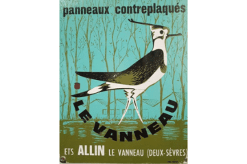
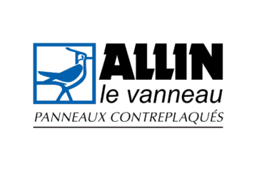
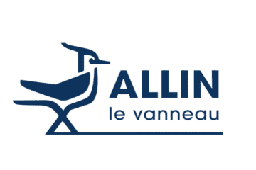
The northern lapwing has always been Allin’s emblem.
It has evolved during the time and was adapted according to the codes and expectations of each period, as well as the company it represents.
When it has been created, the logo was totally absorbed by the universe of wood with its colour and its style full of illustrations.
In 1991, it adopted a more structured and refined look, typical of the plywood panel. It also left its colours of origin to turn to new perspectives.
In 2020, Allin wished to renew its logo while conserving its essence which made of him a recognisable and adopted symbol. Allin entrusted Vanya Basic, graphic designer from Bordeaux, with the mission of renewing its famous lapwing which printed the history of the company.
Allin’s graphic identity also adopted Arbor’s dark blue, alike the other companies of the Group, as a sign of unity and membership. Therefore, the writing has been modernised and the bird put out of its frame to give an image of freedom and volume. Its lines have been redrawn with more delicacy while conserving the bird’s bearing.
All these years, Allin and its northern lapwing have asserted and renewed themselves at the same time, always with a strong bearing, turned to the future.


